medium /// sculpture


“that night in toronto” {art show}

Oh, where do I begin? This show is so important to me. It’s an ode to a Canadian great – singer songwriter and front man of The Tragically Hip, Gord Downie. If you’re Canadian you know all about The Hip. For those of you who don’t, they are an iconic band that so many of us know and love. Gord is a musical genius, and sadly was diagnosed with terminal brain cancer last year. You could hear a nation gasp when that news was made public. I wanted to do something, but what? An art show, of course. Here is the curatorial statement for the show that opens THIS SATURDAY, JULY 8th at Mayberry Fine Art in Toronto {4-7pm}

“That Night In Toronto” 

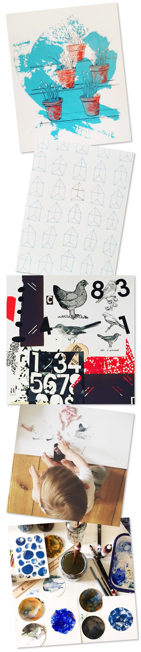
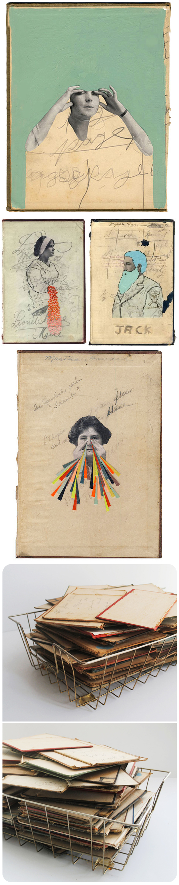
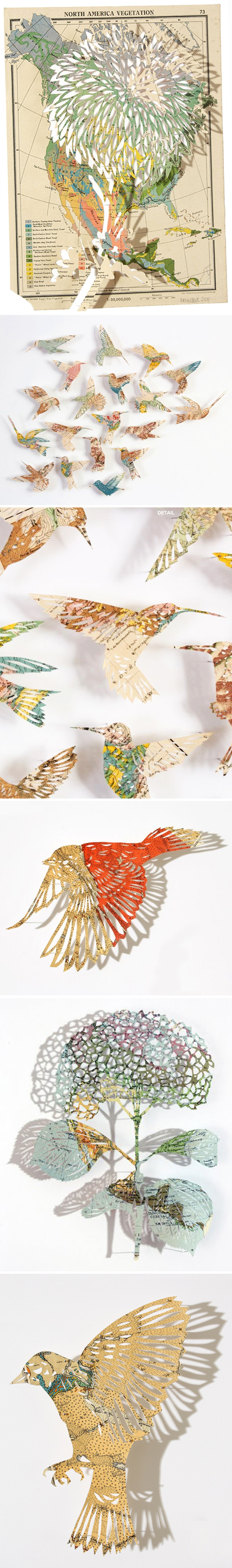
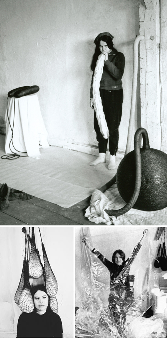
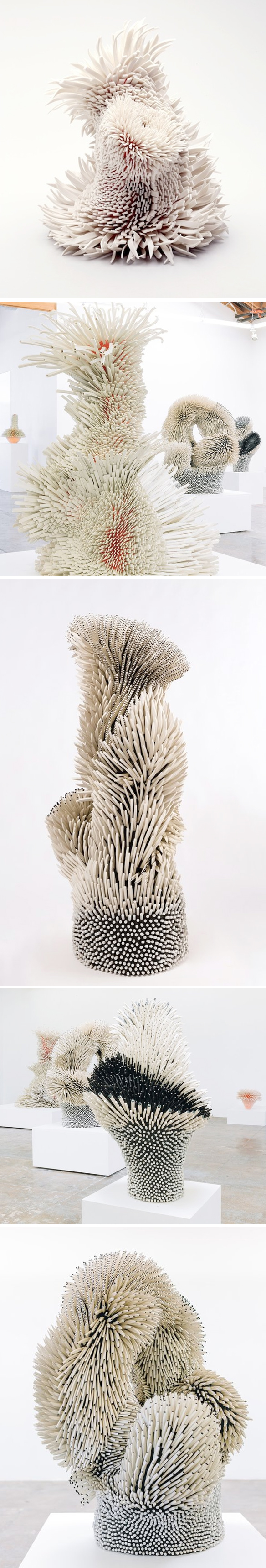
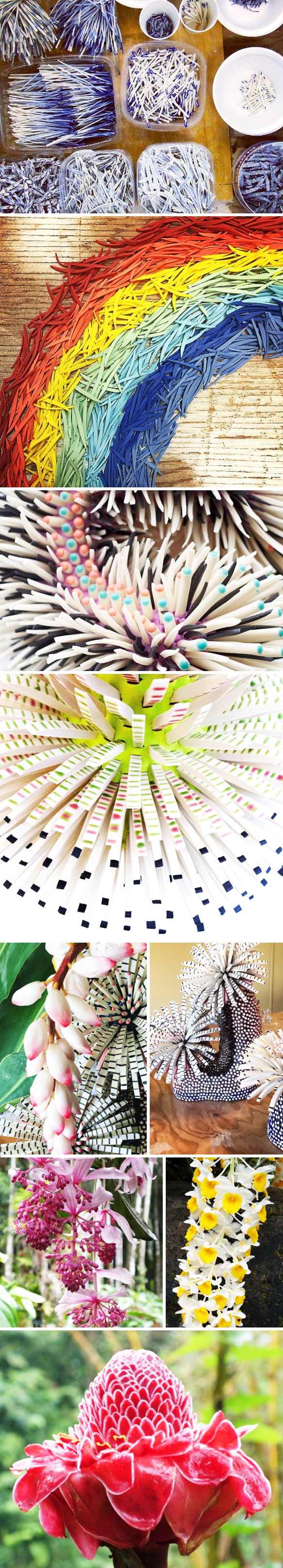
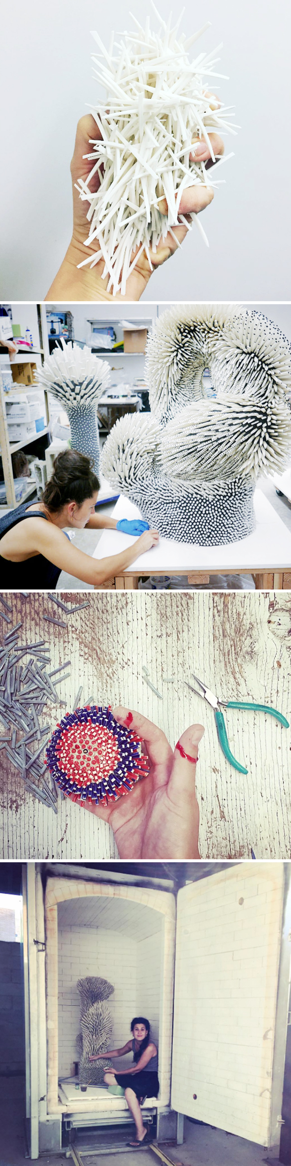
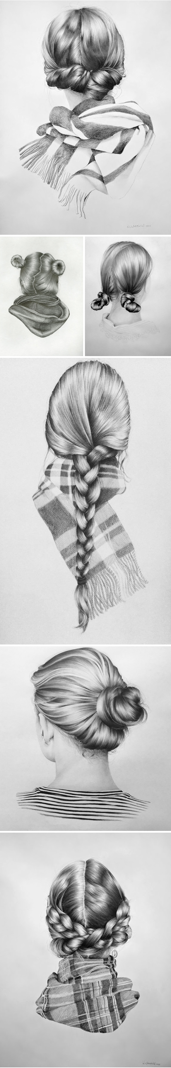
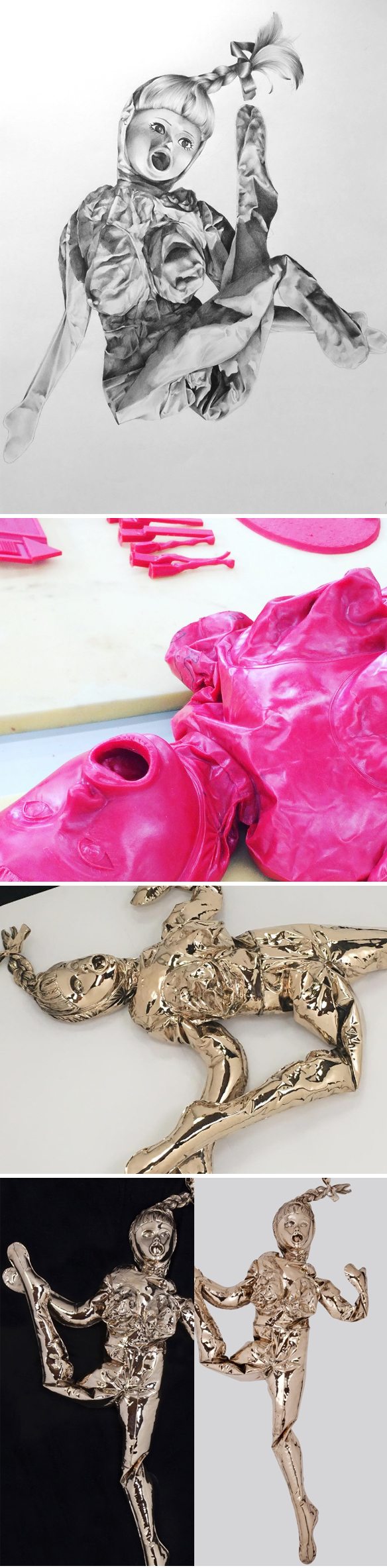
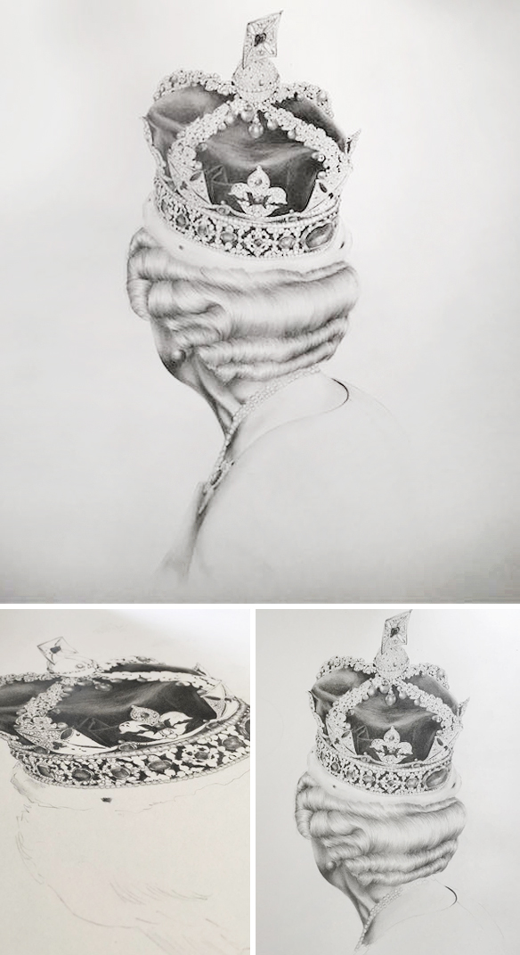
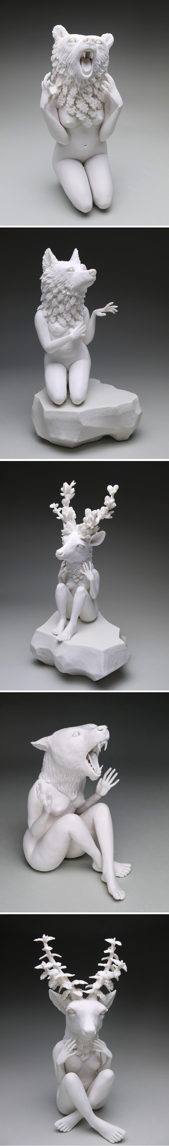
Poetry. That is the best way to describe any and all lyrics written by Gord Downie and The Tragically Hip. From “wheat kings and pretty things”, to “musical chairs, double dares, memorized stairs” the words from these generation defining songs strike a chord in, well, anyone who has ever heard them.  As a curator, and artist, I want to honor this poetry the only way I know how – visually. I asked ten Canadian artists to create original work inspired by their favourite Tragically Hip lyrics. FYI, it was very difficult to choose, which is why some artists have more than one piece in the show! Originally, I was going to assign bits of Hip poetry to each of them, but every artist came back with stories of their favorite songs – memories from road trips, University, concerts, breakups, dance floors, house parties and the list goes on. The paintings, drawings, sculptures, collages, paper-cut pieces they’ve created are beyond what I ever could have imagined. Stunning artwork, each with the magical power to conjure up a song.

This show is a heartfelt tribute from one group of Canadian artists to another – and simply our way of saying, “Hey man, thanks”

ps. Twenty per cent of sales will be donated to the Gord Downie Fund for Brain Cancer Research via Sunnybrook Hospital. 

If you can come, please do. I will be there with bells on, or at least a Hip t-shirt. Mayberry is just across the street from the AGO {324 Dundas Street West}. Send your RSVP to toronto@mayberryfineart.com – see you soon!

Artists {in order shown} : Annyen Lam, Ben Skinner, Meghan Hildebrand, Danielle Krysa {me!}, Sara Genn, Sean William Randall, Don Proch, Jay Dart, Brandy Masch, Sarah Gee Miller


clémentine de chabaneix

Do I even need to say anything? I mean really, that girl holding an alligator kinda says it all, no? This is the ethereal work of French artist Clémentine de Chabaneix. Here are her words about this weird and wonderful work:

…I work with epoxy resin or ceramic, iron and sometimes wood. I often sculpt young ‘Burtonian’ girls, kind of ‘Alice in Wonderland’, teenagers, romantic, a bit gothic. My work is about leaving childhood, metamorphose, struggle… 

Nailed it. Happy Friday.

{found via Club Sensible’s Instagram feed}


gunjan aylawadi


Seriously, how does she do it? Just kidding, I totally know how she does it because I had India born, Sydney based artist Gunjan Aylawadi on my podcast and she told me everything! These are just a few of her latest, and always insane, woven paper sculptures. The series is titled “Place for Prayer” and will be hanging in a new show that opens THIS SATURDAY, June 24th in Sydney at Koskela.

“In the last few years, my slow meditative paper weaving practice has evolved from two-dimensional paper tapestries to three-dimensional geometric sculptures. In this show, I have attempted to create a body of work exploring the idea of prayer and carving out a place for personal meditative contemplation. Inspired by the geometry, architecture and arabesque patterns in temples/churches/mosques that I grew up around, these works are an invitation to viewers to pause, observe, contemplate and rest.”

Sigh. Beautiful. The shows runs until July 23rd. {Also, how great is it that her clothes match her work!?}


polluted water popsicles

Beautiful, until you realize what you’re looking at … “Polluted Water Popsicles”. I have to be honest, I don’t really know the full story behind this project. They only have a Facebook page, with just a little bit of information… but would that stop me from writing about these gross beauties that are making a VERY important point? Absolutely not. Now, that bit of information isn’t in English, so this is what Google Translate told me their “about” section said:

Nice = delicious?
From Taiwan’s 100 polluted water sources, made it into ice, and then re-engraved into a 1: 1 poly model to do the show, through the sense of the impact of beautiful packaging to convey the importance of pure water, and finally to show the real Appearance. So beautiful pudding, you dare to eat?

Works for me! Pretty popsicles, important message … but don’t even think about licking one. Seriously.

UPDATE: Just found out a little more {thanks to Hosanna for commenting on Facebook!} This is what she told me: “These were created by 3 design students in Taiwan for their graduation exhibition. They took water samples from 100 water sources (including rivers, sewers, streams, etc.) that people normally wouldn’t notice, but were already polluted. They used the water samples to make popsicles and in turn made 1:1 poly models of the popsicles, which are what you’re seeing. They did this to emphasize and show how important clean water is to the environment.”


summer camp 3 : unconventional and absurd

Unconventional and absurd? Yep, that pretty much describes my “s’moreo” photo for the day 7 prompt {“snacks”} from the first week of camp {combined with a photo of me, age 6}. And yes, you better believe I have a fresh s’moreo sitting right beside me at this very moment! So, before we get started on week 3 at AFYE Summer Camp, I want to show you just a handful of images created for last week’s art project (hashtagged #AFYEcamp). “Collaboration-Nation”, indeed! I did it too {posted below} by getting my husband and son to each make marks on a scary wooden panel I’ve been nervous to “ruin”… and I love it! Red marks made by my son Charlie, orange marks by my husband / amazing AFYE producer Greg, and the final piece by me:


Ahh, finally, that wood panel has paint on it… the title: “The rainbows and candy-colored chaos gave it away – Suzanne was hashtag blessed.”

And, of course, here are just a few of the many, many fabulous pieces you all collaborated on {photo credit links are at the very bottom of the post} :

So fantastic! Speaking of which, let’s get on to this week’s challenge:

Art Project No.3 

Shopping List : Yep, we’re heading to the grocery store for our art supplies this week {feel free to buy ingredients for s’moreos while you’re there!}. Using unconventional, AND CHEAP, materials can help bring back that fun, childlike joy in making. Paper plates, bags of macaroni, lunch bags, plastic bags from the bakery dept, pie tins, potatoes for potato stamps… whatever you can find! And if you want this to be super duper cheap, ie free, just raid your recycle bin!

Artist Examples: 

Here are three artists who don’t use the usual go-to art supplies for their work. First, American artist Hollie Chastain. She uses old book covers in place of canvas:

UK based artist Claire Brewster works with old maps and atlases:

Lydia Ricci uses, well, everything:

And finally, a few images of the absurdity embracing Eva Hesse:

Love!

Ah, another week of camp done… another s’moreo eaten! Thank you to Saatchi Art for supporting summer camp, and thanks so much to you for listening! AFYE camp will be back on Saturday June 17th … until then, be sure to hashtag your unconventional material piece {or pieces!} on Instagram with #AFYEcamp. Have fun!

Other links:

  1. Hollie Chastain on AFYE : Episode 15
  2. Claire Brewster on AFYE : Episode 84
  3. “Eva Hesse” – Documentary by Marcie Begleiter and Karen Shapiro
  4. Book signing at Book Passage Ferry Building, SF (June 9th, 6pm)
  5. Hotbed Benefit 2017
  6. Plant Hope Foundation
  7. Venice! European Cultural Academy
  8. TO SUBSCRIBE TO THE PODCAST: subscribe on iTunes.

*Photo credits from Project No.2, in the order they appear above:

1. @mary_stack // 2. @elisegedig  //  3. @nullsie  //  4. @bababeloco  //  5. @mlestudio


carole feuerman … and venice

Did it take you a moment to realize these weren’t actual swimmers? Yep, me too. This is the absolutely gorgeous work of well known American hyperrealist sculptor Carole A. Feuerman... and I’m actually going to see some of her work in person this August at the Venice Biennale! She has several exhibitions happening at one time in Venice. She’ll be showing work at: Giardino Della Marinaressa, Bel Air Fine Art, Palazzo Mora and Palazzo Bembo –  both palazzos will each have a special Feuerman swimmer exhibitions during their shows, called Personal Structures, Open Borders. The course that I’ll teaching in Venice {I’m one of several instructors from Aug 7 – 20} is taking place at Palazzo Bembo through the Academy at the European Cultural Centre – here’s hoping one of Carole’s swimmers is close by!

ps. I just found out that there are ONLY SIX SPOTS left at the academy the weeks I’m there. To find out more, visit the ECC’s site. I hope we can see Carole’s work together! Oh, and stay tuned because I’ve got a collage contest coming up with the prize being the tuition for one week at the Academy … worth EUR950! I’ll talk about this more on the podcast this weekend. 


aimée henny brown

Gasp! “Shelter”, an installation by Canadian artist Aimée Henny Brown. I’m not sure where to start? The mixed media collages, the pink ranger station… that paper cutting!? Ok, I’ve got no words so I’m handing this over to Aimée :

“Exhibited at the Ranger Station Art Gallery for June, 2015,  the work was inspired by my artist residency in the district of Kent, and through access to archives held at the Agassiz-Harrison Museum and Archives.   Through this body of work, I am visually exploring a period in this area’s history where the land was wild, shelter was provisional and industry was just beginning to imagine its place in the Fraser Valley. The re-presentation of these historical moments is also informed by imagined, alternative visions of what the term shelter can represent. In its most essential form, shelter is depicted as a triangle – an icon of sanctuary and dwelling. The triangle motif is employed throughout the work as a talisman to conjure concepts of protection, survival and home – but it is also the essential geometric building block of geodesic domes, tent structures, gabled walls, pitched roofs and signal flags. In this exhibition, the triangle is both form and metaphor. The aim of this work is to glimpse into local histories while discovering the imaginative potential of digging deeply into this past, and closely examining our relationship with place.”

Beautiful. Happy Friday.


“suitcase full of shards”

Imagine if you will, a little girl growing up in a kibbutz in Israel who now travels the world – her suitcase filled with tiny hammers and shards of colorful ceramics. Well, no need to imagine because I’ve got her on the podcast! Yep, today I’m talking to Israeli artist Zemer Peled … from the big island of Hawaii. She’s there working on a commission for a private collector, before she jets off to France for a residency in Limoges. Sigh. Alrighty, you can listen right up there underneath that beautiful spiky thing, or you can subscribe on iTunes.

First up, Zemer in action. Hammers, shards, goggles… because, safety first:

🔨Just another day at the studio 🔨

A post shared by Zemer Peled (@zemerpeled) on


Isn’t that video meditative? But sharp! Ok, next… these are Zemer’s flowers that I wrote about a couple of years ago. You’ll notice they start in blue and white, thanks to her interest in Japanese ceramics, and then slowly evolve into some crazy shapes and exotic color combos:

I mean, come on! GORGEOUS! The detail is astounding, and her patience is awe-inspiring. Well we’re not done yet… the evolution continued from there! Her flowers started growing and twisting, and some might even say, they began to dance:

Truly amazing. So. Many. Shards.

Next, her colors! She did start with blue and white as I mentioned above, but much like her colorful personality, Zemer’s work is now filled with a rainbow of beautifully broken bits:

Ahhhh, and yes, those are the flower photos she took while in Hawaii. I see many future pieces & palettes that will be inspired by those beauties! {ps. about half way through the images above you’ll see the floral piece she was working on in Hawaii… partly hidden behind some perfectly coordinated local flora.}

Zemer’s work is beautiful, but let’s not forget THE DANGER. I asked if she ever cuts herself. Her response.. ‘Oh, all the time! :

Bleeding fingers and giant kilns… be safe Zemer, be safe {you have to be healthy when you marry your mystery Canadian!} Thanks so much to Zemer for talking to me instead of going to the beach, and thanks as always to Saatchi Art for supporting the episode. Now, next week is the last week in Art For Your Ear’s Season 1, but I’ve got a fun plan for the summer until September when Season 2 starts. I’ll give you all of the details next week! Thanks for listening, there will be more art for your ear next weekend.

Other links:

  1. Royal College of Art, London
  2. Archie Bray Foundation, Montana
  3. Bernardaud, Limoges France
  4. Amanda Smith episode
  5. Banff Centre, Canada


“bit of a pencil snob”

The moral of this episode … show your work to random people in pubs because it could be life changing. London based artist, and self-described ‘pencil snob’, Nettie Wakefield is my insanely talented guest today. Listen right up there under that polka-dotty birthday girl, or you can subscribe on iTunes.

First, her “Reversed Portrait” series. Absolutely stunning – I cannot imagine getting a pencil to do this. Here are a few of my favorites, and one of them just might be Nettie herself:

Any guesses? Ok, I’ll tell you… that final drawing above is a “reversed self-portrait” of Nettie. Lovely.

Next, “Brandy the Blow up Doll” … she’s lovely too. But in a, hm, different way:

So cool! I love that she pushed herself into the world of sculpture. I’m very curious to see if her sculpture work continues.

Ok, now this is just crazy and surreal. These are a few of the drawings she did at Dismaland. Yes, that’s right… by showing her portfolio to a random guy at a pub, she ended up drawing reversed portraits at Banksy’s Dismaland. What? Who does that happen to? Answer: Nettie.

Unbelievably cool. Speaking of which, look at that close-up?! …… ok, stop looking because I have more to show you. Here’s the piece she did for Context in New York {CONTEXT Art fair NYC / Corey Helford Gallery / Pier 94} :

Sigh. That one might be my favorite reversed portrait in Nettie’s portfolio… well, maybe a close second to Liz:

Yes! This was part of a project in London to honor Queen Elizabeth’s 90th birthday … and in case you aren’t aware, I  have a strange obsession with images of the Queen. It might be a Canadian thing?

Finally, a lovely photo of Nettie – the front of her, not the back of her head:

Beautiful. Thank you so much to Nettie for telling me her story, and sharing a few chopped out secrets! Thanks to Saatchi Art for supporting this episode, and as always thank you for listening. There will be more art for your ear next weekend.

Other links:

  1. Nettie on Instagram
  2. Banksy
  3. Dismaland
  4. Shepard Fairey
  5. Art Below


crystal morey

crystalmorey

Fierce but fragile … beautiful, elegant, porcelain creatures by American artist Crystal Morey. Here are her words about why she creates what she creates:

“As a species, we sit at a pivotal moment, faced with monumental questions leading to difficult, uncertain answers. My figures exist on this frontier, absorbed in their own feelings of stress, anxiety and ambivalence. Sculpted from the silken white earth of porcelain, I see these delicate figures as containing power – as modern talismans and precious telling objects. They are here to remind us of our current trajectory and potential for destruction and downfall.” 

{Thanks to ceramicist Amanda Smith for pointing me to this lovely work}