medium /// paper


“i sandwich everything in that stuff”

hollie1

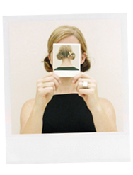
Another Saturday, another episode of ART FOR YOUR EAR! This time I’m talking to full-time graphic designer turned full-time collage artist, Chattanooga Tennessee based Hollie Chastain. We talk materials {there is a lot of gel medium in her world}, being an artist & mother, and she even threw in a hilariously mortifying phone anxiety love story at the very end. You can listen right up there under those lovely ladies, or subscribe on iTunes. As you’re listening, take a look at the work we talked about in the order that we talked about it. Let’s start with the very first piece of Hollie’s that I ever saw/wrote about. It was the lead image in the “curated” blog post that I did for Etsy way back in the day:

hollie2

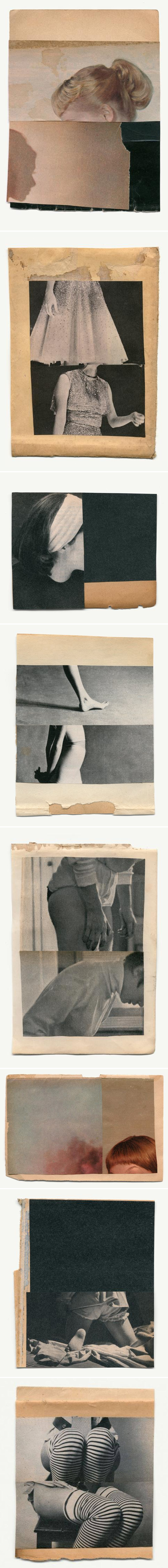
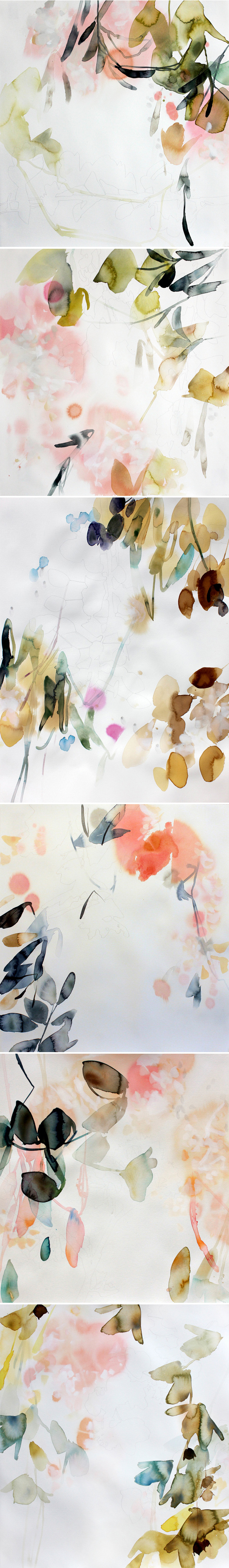
Ah, I still love that piece so much! And below is the piece, titled “Afterthought”, that she mentioned when talking about using gel medium not only as glue, but also for image transfers:

hollie3

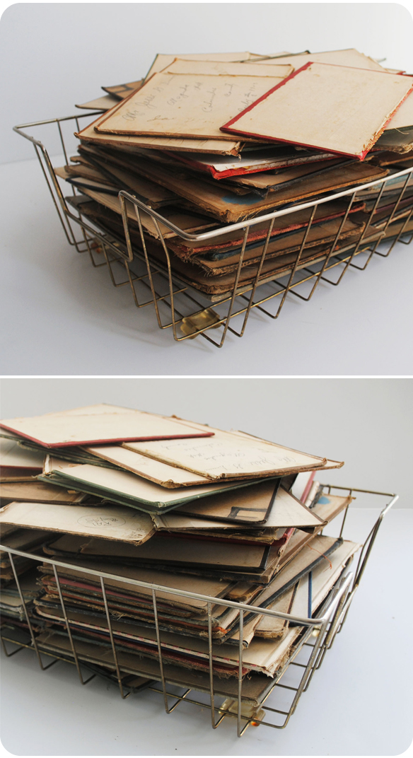
I have to try that! Speaking of things I need to try… book covers! Oh, so many found book covers. Her favorites of course being old school text books complete with scribbles by bored children:

hollie4

Gah! Her book cover pieces are my absolute favorites! Turns out she has a studio FULL of them… see:

hollie5

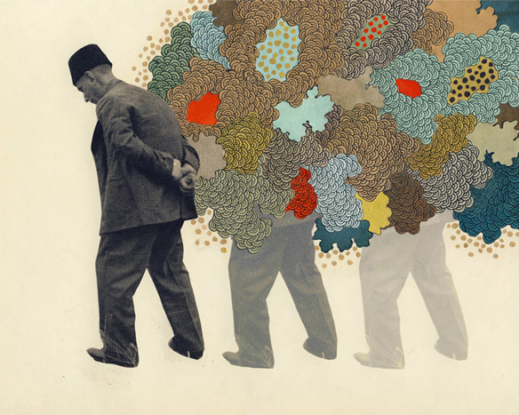
Oh. Jealous! Next up, the illustration she did for The Baffler:

hollie6

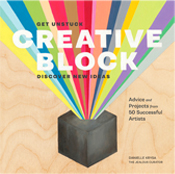
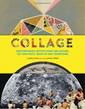
Mixed media, indeed! I quickly mentioned that Hollie was one of the artists in my book, Collage… this was the fantastic original she made for the book, along with a shot of one of her double page spreads:

hollie7

Love. So. Much. And finally, we didn’t actually talk about her studio space, but I found this photo on her site and I absolutely love this crazy beautiful mess:

hollie8

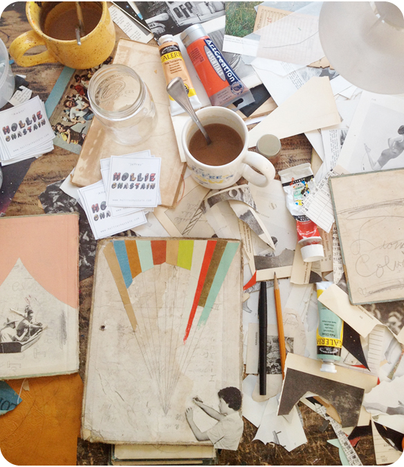
Doesn’t that make you want to make something right now!? Me too. And with that, I’ll say thank you to Hollie for joining me today, and thanks so much to you for listening {and looking}… there will be another episode waiting for you next Saturday!

ps. oh, and a link to Lisa Congdon’s book, Art Inc. & a link to Dolan Geiman’s site.


annie vought

annievought

Whoa. PAPER. Paper that has been really, really, really cut. A lot. My hand is cramping just looking at these insane pieces by California based artist Annie Vought. That white dome of triangles? That arc of text bleeding off the edge of a black page? And are those tiny little houses in that pattern-only piece? Yep, I said it once, and I’ll say it again… whoa.

{Thanks to yesterday’s artist, Annie O’Dorisio, for sending me a link to Annie Vought’s work… so many talented Annies in one week!}


annie o’dorisio

annie-odorisio

Pen & ink, and wool on heavy paper. LOVE. This is the playful, geometric mixed media work of American artist Annie O’Dorisio. Simple, yet complex, and such a perfect combination of materials:

“I lay down a shape in pencil, working with it until it is true to the image I have in mind. The shapes and patterns end up being quite masculine. The wool serves as not only a way to add sculptural dimension but as a vehicle of warmth. Through this method I have created a language between the two mediums that is formal yet natural.”

Sigh. A lovely way to start a Monday.


anna maria bellmann

anna-bellmann

Oh my. Delicate, floral, paper-cuts by German artist Anna Maria Bellmann. These gorgeous pieces were a lovely surprise when I went to look at her portfolio. I actually found her on Pinterest because of these blue beauties:

anna-bellmann_blue

… also delicate and floral, but not paper-cuts! These are called cyanotypes. Here’s the deal, in Anna’s words:

The cyanotype is an old precious printing method, also called Prussian blue print. 1842 discovered by Sir John Herschel, one of the greatest scientists of his time, it was initially used predominantly, to blueprints – create – technical drawings for architectural, engineering or shipbuilding. The cyanotype uses the light sensitivity of certain iron salts that form insoluble crystals under UV irradiation. Is exposed in the sunshine, developed with running water, the result is the beautiful color tone, the “Prussian blue”. Photograms of this kind allow a very fine representation of floral structures – as a symbiosis a gift from the sun, blue sky and botanical beauties.

Ah, so, so lovely… all of it!

{Blue pieces found via Lisa Congdon on Pinterest}


katrien de blauwer

katriendeblauwer

Simple. Elegant. This is the collage work of Belgium based artist Katrien De Blauwer. Vintage paper and a few perfectly sliced images that look a lot like old film stills… now I want to see all of these movies. If only they existed.


ryan heshka

ryanheshka
ryanheshka2
ryanheshka3
ryanheshka4

Are you seeing double too, or am I just dizzy from this fantastic, vintage, very sassy work! Rich gouache, curvy/confident gals, and shiny high heels as far as the eye can see! This is the vintage inspired mixed media work of Vancouver based artist Ryan Heshka. My friend Martha Rich introduced us over email today… and before I even wrote him back I had this post ready to roll! Instant love… x2.


elise morris

elisemorris

Dreamy. Watercolor, and faint traces of pencil drawings on paper. This is the elegant work of American artist Elise Morris... gorgeous colors, perfect compositions, and of course, botanicals … because clearly I can’t get enough of botanical paintings. Happy weekend, everyone!


johan barrios

johanbarrios
johanbarrios2

Graphite and watercolor. Oh, and paper. That’s it. These mixed media drawings are the gorgeous work of Colombian artist Johan Barrios. Perfectly drawn portraits, on washy/loose fields of paint… I’d like to write more, but instead I’m just going to stare at these in awe. {Drawings!?}


strike away show

strikeaway

Remember when your parents said, “Don’t play with matches” ? Yeah, well these artists did NOT listen… thank goodness! Over the last few weeks, I kept seeing fabulous little matchbox interventions pop up on Instagram, and so naturally the hunt was on! When I traced them back to the source, I found “Strike Away”a show that has nearly 450 altered matchbooks by 225 artists from around the world, curated by Courtney Cerruti and Alicia Dornadic. So fun, and oh so creative! From “burned books”, to bowling lanes, to little packs of cigarettes, this show truly covers the spectrum! Sigh. Sorry Mom, I might have to go find some matches of my own! {The show is up until June 20th at Paxton Gate Kids located at 766 Valencia St., San Francisco. If you can’t make it to the show, check out their Instagram feed – lots of the work is posted there}

*Just a fraction of the talented artists involved, shown above: 1. Jane Mount  2. Crystal Morey  3. Mandy Behrens  4. Vanessa Wimmer  5. Sara Diamond  6. Molly Hatch  7. Diana Rodgers  8. Nik Sonfield  9. Nik Sonfield


d iris sigmundsottir

dirissigmundsottir

Oh. So pink, so feminine… these are the collages of Iceland based artist D Iris Sigmundsottir. That top piece is absolutely genius {I need her to do a whole series!} – and don’t even get me started on that pink hair and torn-paper cotton candy. Killing me.