medium /// illustration


step-by-step. every day.

tinaberning1

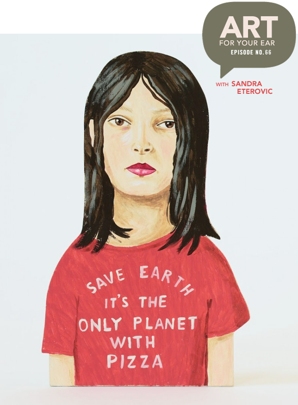
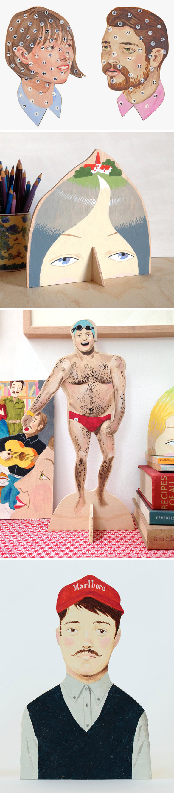
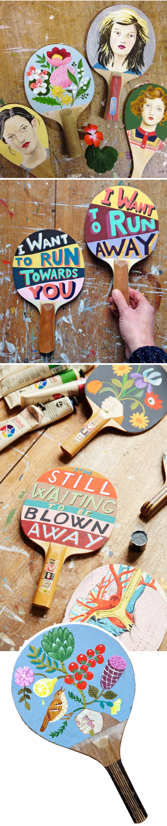
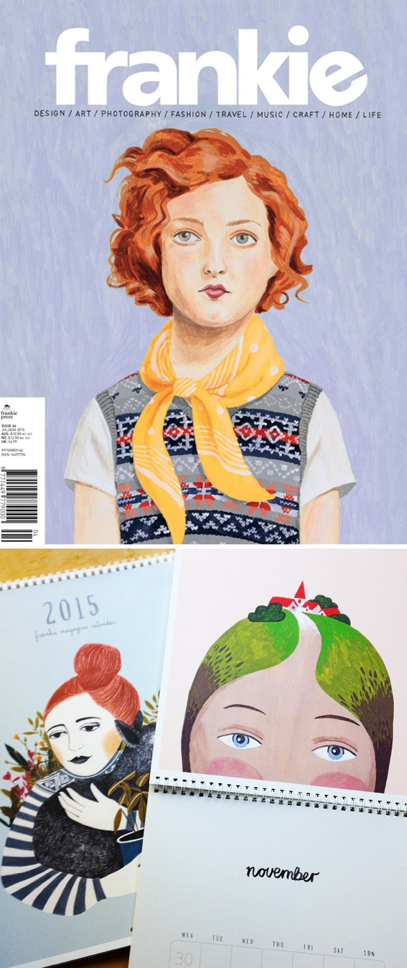
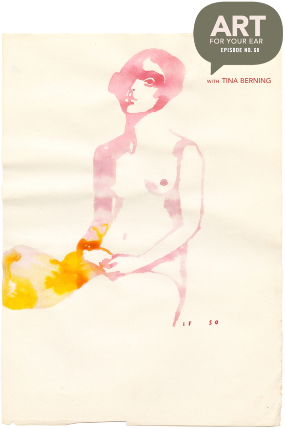
“Drawings are like wine, they need time to develop.” Lovely words from an amazing artist … who I might just have a major girl crush on. I have loved, and I mean loved, the work of Berlin based artist/illustrator Tina Berning for years. And now, if it’s even possible, I love it even more. Tina is obviously insanely talented, but I found out today that she’s also very smart, poetic, funny… and organized! I tried not to gush too much, but “fan-girling” was the name of the game. So, let’s get on with it. You can listen right up there under that lovely washy woman, or you can subscribe on iTunes.

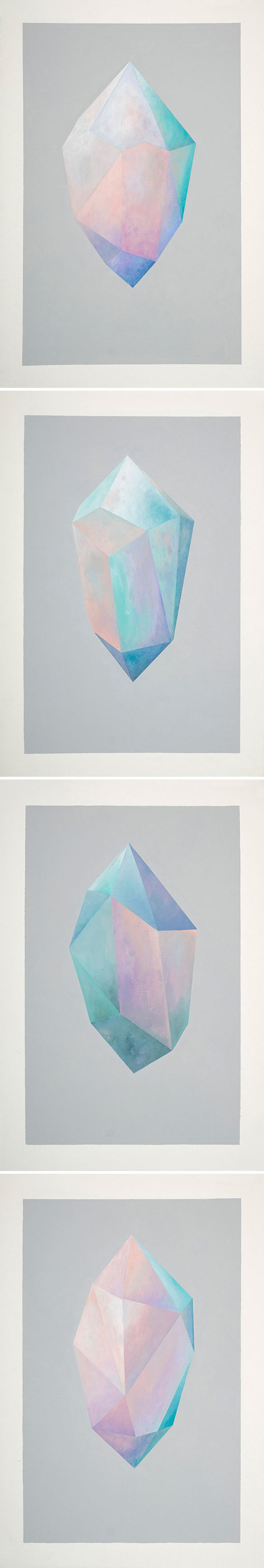
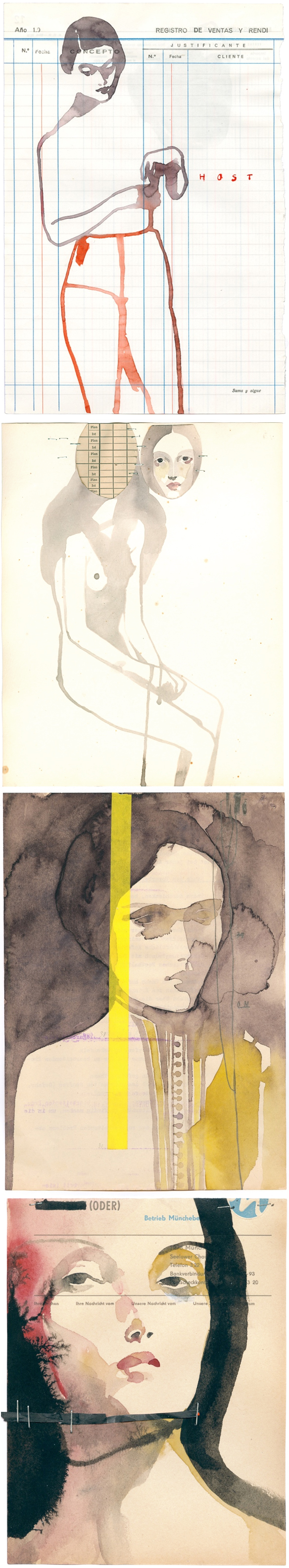
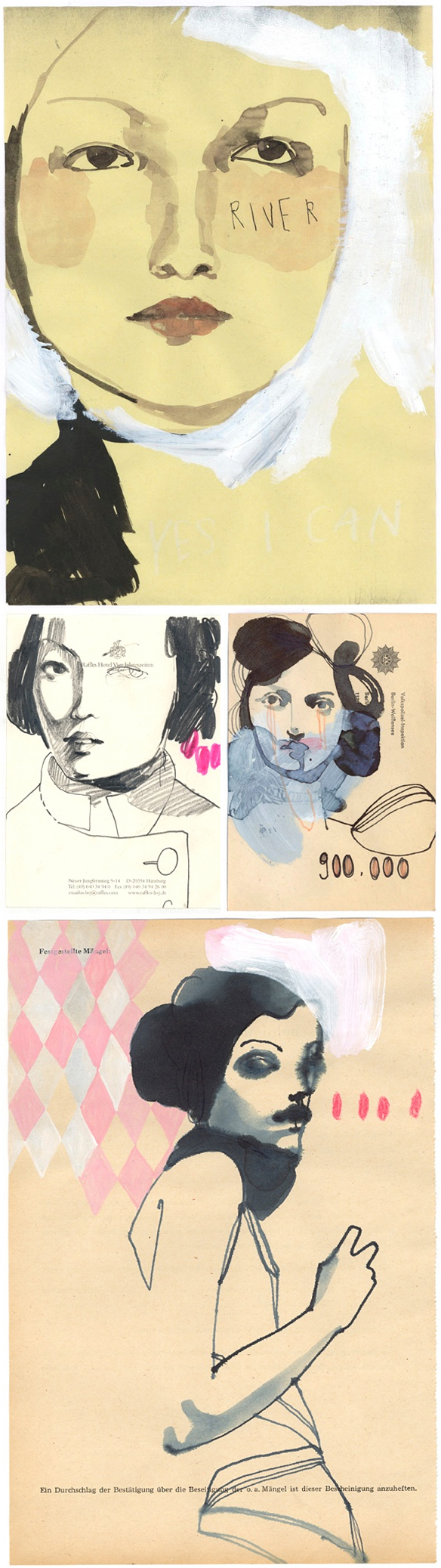
First, these are just a few of Tina’s gorgeous paintings on found paper that are currently showing at Alison Milne Gallery in Toronto {until Nov 5, 2016}:

tinaberning2

Gah! See? How can I not fan-girl over her! Now, here’s where the smart/organized part comes in. Everything she does goes into one of three boxes: CRAP*, NOT SO GOOD, NOT SO BAD:

tinaberning3

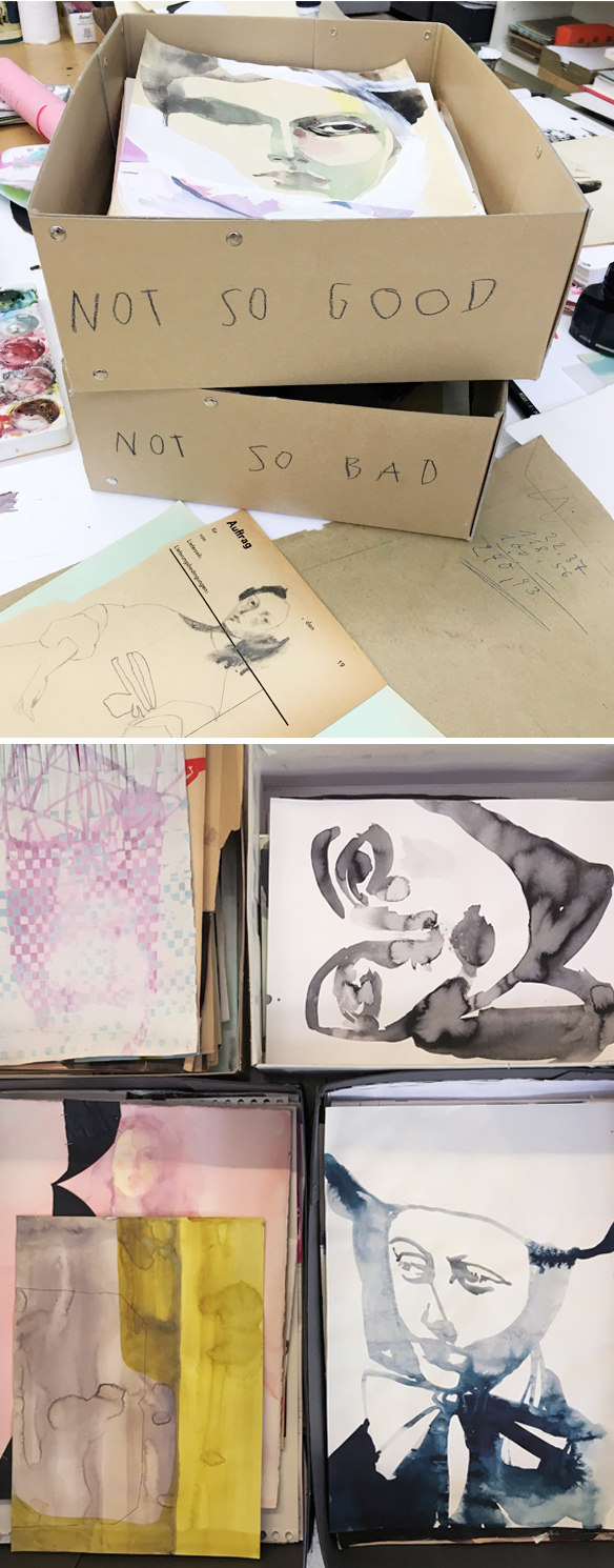
*CRAP not shown here … Tina assured me that there really is a CRAP box, but I can’t imagine any of her work ending up there. I love love love this system and I am totally going to implement it in my studio, and I honestly think every artist should. She comes back to the CRAP and NOT SO GOOD boxes later and uses those pages for collage bits, or as a base for new work. Truly brilliant, and a perfect jumping off point for creativity.

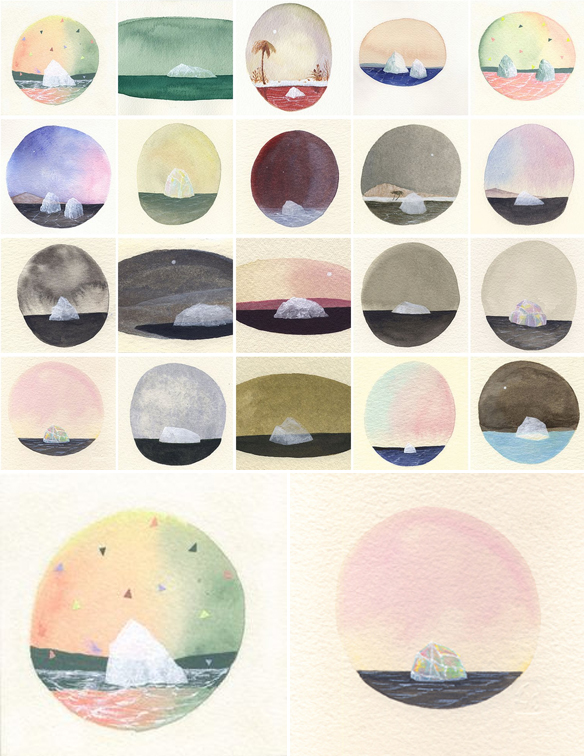
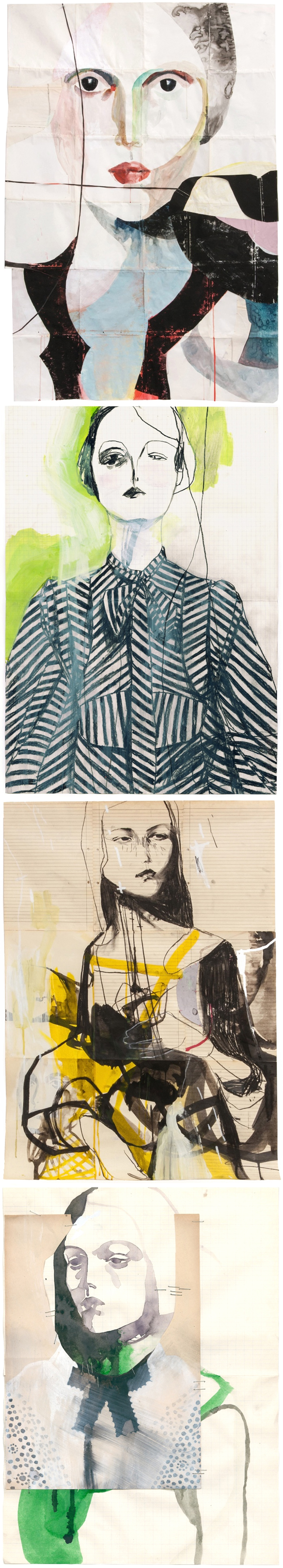
Next, one of my favorite projects ever, “100 GIRLS ON CHEAP PAPER”… which is exactly that:

tinaberning4

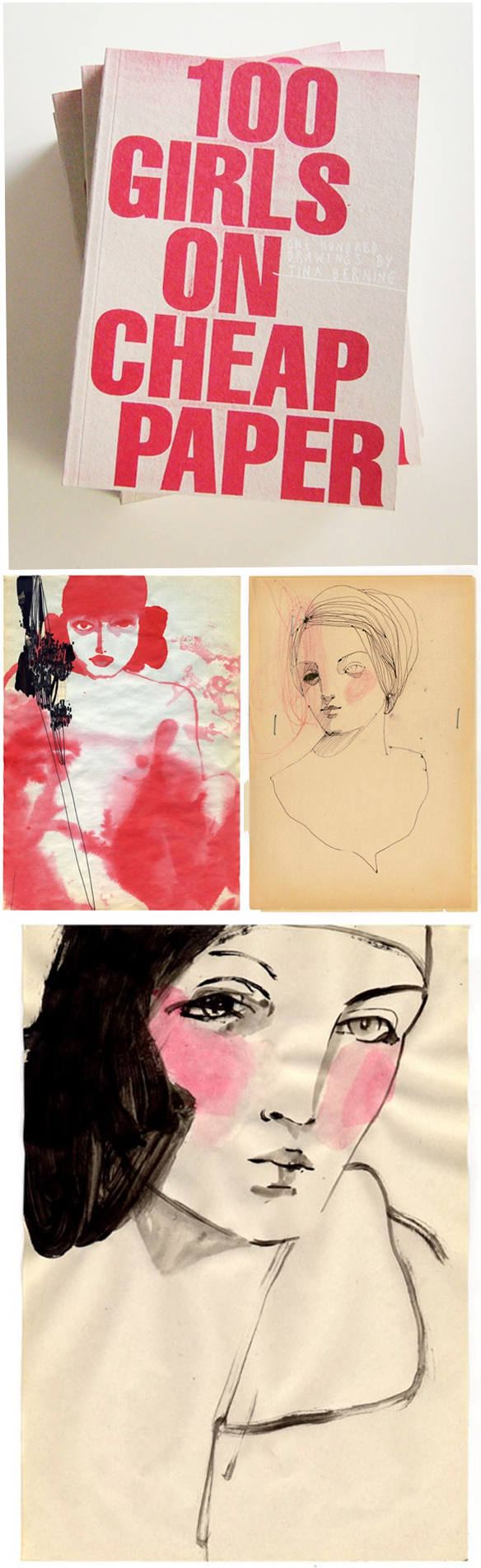
So beautiful. This project started online, it then became a book, and then a show… and then a traveling show. Most of the girls from the original exhibition sold, so when it traveled to New York and Japan, Tina had to paint 80 new women for each show! Here are two pieces from NY and two from Tokyo:

tinaberning5

Do you know how much self control was required for me not to post all of the pieces from this series? Very. Difficult.

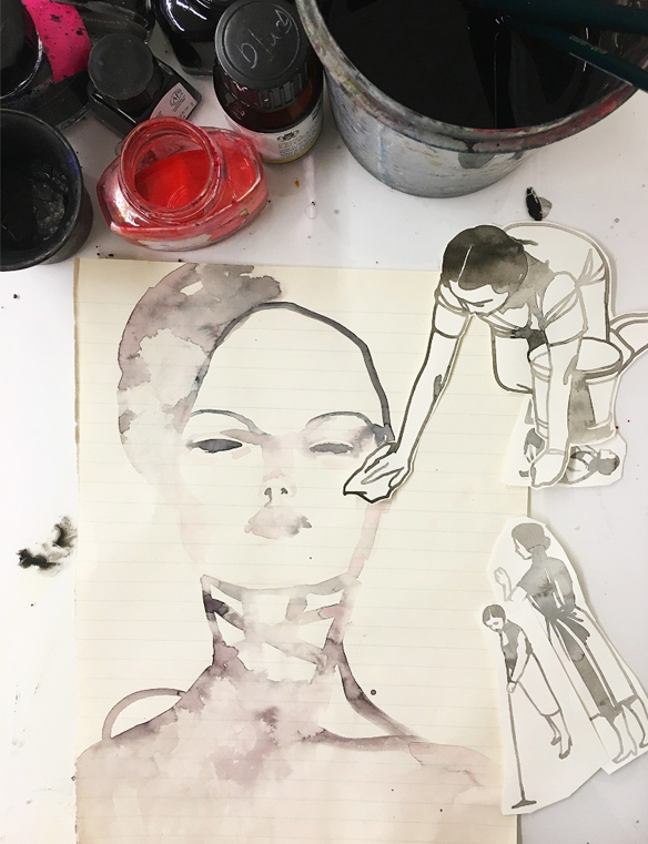
So, when you work on vintage found paper, most of your work will be small… unless you use old record album slips, or stitch lots of small pages together. Yes. That’s what Tina does from time to time, and no surprise, they’re gorgeous:

tinaberning6

The staples! I love the staples!

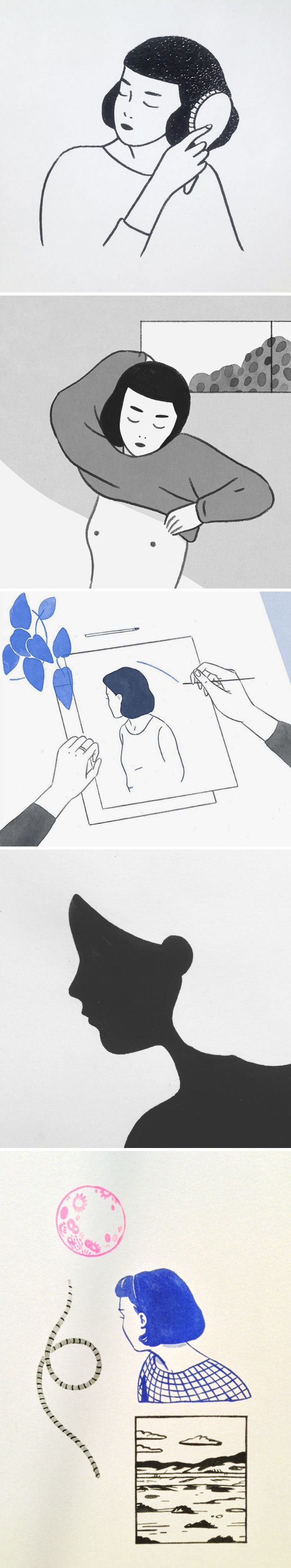
And finally, in the not-so-speedy speed round, Tina told me her favorite paint colors are black and red. I guess she wasn’t kidding:

tinaberning7

Yep, two words… Fan. Girl. Oh, I enjoyed this so much, and I hope you did too. Stunning work, a lovely person, and advice that I will use forever. Thank you so much to Tina for doing this with me, thanks to Saatchi Art for supporting this episode, and thanks to audible.com for making my new book into an audio book! To preorder a copy for FREE {or to pick up any other book you might want} just use my link: audibletrial.com/JealousCurator. But wait, there’s more… thank YOU for listening! There will be more art for your ear next weekend.

Other links:

  1. Tina’s current show at Alison Milne Gallery, Toronto 
  2. Heinz Edelman


laura manfre

lauramanfre

I am so not into this whole Pokemon Go thing, but if I could hang out with that pink-haired girl and her cat while eating Pikachu donuts… yeah, then I’d be all in. This is kind of a crazy post, but there were so many tidbits in the portfolio of French artist/illustrator Laura Manfre that I decided just to make up my own treat-filled, Pokemon-esque narrative. Happy Friday … I hope someone brings you donuts today.


“i guess i better be an artist now”

sandra_eterovic1

Oh, this was so much fun… but painful from a technology perspective! Don’t worry, we stitched it all together so hopefully you won’t even notice {thanks Greg!}. Today I’m talking to Melbourne based artist Sandra Eterovic. She paints weird and hilarious things on wood in a folk-artish yet modern way. Sandra went from studying Art History, to designing rude underpants, to making the scary jump to full-time artist… let’s just say her inner critic had an opinion about that. Anyway, you can listen right up there under that amazing pizza t-shirt, or you can subscribe on iTunes.

So, let’s start with a few of my painted cut-wood favorites:

sandra_eterovic2

Marlboro. So awesome. Speaking of awesome… paintings on vintage ping pong paddles? YES!

sandra_eterovic3

Oh I love them so much… not to mention the salami and lemon growing off that vine! ♥

Up next, the gorgeous cover that Sandra did for Australia’s Frankie Magazine – and a shot of her page in their 2015 calendar:

sandra_eterovic4

So cool!

Now, let’s talk art prizes. The piece below, with all of the crazy t-shirts, titled “Read My Mind”, is the piece that Sandra has in the run for the R&M McGivern Prize. $25,000. Yeah. Just think of all of the wooden t-shirts she could make with that! If you’re in Melbourne on September 16th, go and vote for her! It’s a people’s choice award, so let’s get this done people! Here’s her painting, followed by a few of her other ‘funny things on shirts’ paintings that I love:

sandra_eterovic5

Come at me bro! HAHAHA! I love that one.

Ok, so in the not so speedy speed round, Sandra said she’d rather be a mermaid than a unicorn. This painting instantly popped into my head… I knew Sandra had painted a mermaid before. Here she is in the form of a sassy tattoo/scarf:

sandra_eterovic6

Ok, I’d want to be a mermaid too. And finally, I really wanted to include a photo of Sandra herself so you could see who you were listening to! Here she is in her lovely home {photo via The Design Files}:

sandra_eterovic7

Beautiful… Sandra, her work, this conversation, all of it! A lot of her work can be found in her shop, so pop over and pick something up … a flower-covered ping pong paddle perhaps! Thanks so much to Sandra for bearing with me through our technical difficulties, and for being so open and honest. Thanks to Saatchi Art for supporting the 66th episode, and thanks to audible.com for making my new book into an audio book! To preorder a copy for FREE just use my fancy link: audibletrial.com/JealousCurator. And finally, THANK YOU for listening. There will be more art for your ear next weekend.

Other links:

  1. Design Files 
  2. Frankie Magazine
  3. Craft Victoria
  4. R&M McGivern Prize, Melbourne
  5. Elizabeth Gilbert’s TEDTalk
  6. Martha Rich
  7. Lisa Congdon


mark todd

marktodd_comics
marktodd_ww

What? A “Tell Truth Magic Rope” included too? Yeah, I’m going to need this in my collection. Ok, I don’t have an action figure collection, but if I did, this crazy little Wonder Woman would be the STAR! This is the fantastic and hilarious work of LA based artist/illustrator Mark Todd. All of these pieces, and many more, are in a new show that opens tomorrow night, September 2nd 8pm – 11pm, at  La Luz de Jesus in LA {4633 Hollywood Blvd}. The show is called “Covered” … here’s the gallery’s description:

“Todd reinterprets comics from his youth, as well as earlier, iconic ‘ultimate collectors items”. Most of the pieces in this show are based on these types of desirable comics, such as number ones in the series, or the first appearance of a character which were often unobtainable for a young, comic obsessed Todd and his small weekly allowance. In Covered he keeps his interpretations of these covers closer to the source than in previous shows, channeling a combination of confidence with playful naivety, injecting humor with purposeful “mistakes” such as misspelled text and truncated sentences.”

So awesome! If you can go, GO. The show will be up until October 2nd.

ps. I don’t have any Star Wars collectibles in my non-existent collection either, so clearly I’ll need to add a limited edition Mark Todd “CHEWBACK” to my list:

marktodd_chewy

So. Good!


jordan andrew carter

JordanAndrewCarter

I can’t seem to let a week go by without doing a portrait post… and then Queen Elizabeth shows up in the mix and there’s literally no way I can resist! This is the icon-filled, flat yet detailed, mixed media work of London based artist/illustrator Jordan Andrew Carter. Iris Apfel and her glasses caught my attention, and Liz sealed the deal!

ps. These women were calling my name, but Jordan’s portfolio also includes a whole bunch of boys from the world of Wes Anderson. So good. {some of his work is available via his shop}


courtney wotherspoon

CourtneyWotherspoon_iceream

YUM. The portfolio of Toronto based artist/illustrator Courtney Wotherspoon is filled with all sorts of wonderful things… portraits, quirky collections, gorgeous lettering… so I had a really hard time deciding which pieces I should write about. And then I found these delicious painted/drawn beauties. Yep, they were screaming my name on this very hot August day. I’ll take one of each, please! Happy weekend.

ps. congratulations to Courtney on becoming a mama for the second time, only two days ago… get that woman some ice cream STAT.


kaye blegvad

kayeblegvad

Elegant ladies and delicate hands ~ sigh ~ this is the lovely work of London-born, Brooklyn-based artist/illustrator Kaye Blegvad. I suddenly feel like burning some incense and doing yoga all afternoon… nude. Hm. Maybe not.


“magical portals & secret painting parties”

rebeccachaperon1

Oh, so many mysterious landscapes, strange little girls, and what I can only assume to be a lot of empty tubes of black paint! I’m talking to Vancouver based painter Rebecca Chaperon today, and as usual, I have lots of questions. Warning: We had some major technical difficulties getting this episode recorded, but we did it! There is the occasional wifi glitch, so just ignore those, ok? Thanks! You can listen right up there under Rebecca in her studio, or you can subscribe on iTunes.

Let’s start with the first series of Rebecca’s that I ever saw… “Like a Great Black Fire”:

rebeccachaperon2

Gorgeous! And surprising to learn that she didn’t actually use that much black paint. Speaking of which, we talked about the dramatic swing she took with her color palette – from dark/moody to pastel/sweet. Her work still looked like her work, but the colors were flipped. Here’s a little visual evolution:

rebeccachaperon3

Ahh! I love it all, but if you follow me, you’ll know that I have a soft spot for pink. That final piece – “Lady of the Pink Lake” – yeah, I am completely and totally in love with that! It’s a perfect blend of all of her work… ice, landscapes, portals, weird little girls. Love it.

Other things I love from Rebecca’s portfolio? These amazing crystals, ie. her “Tesseract” series:

rebeccachaperon4

Oh my goodness… it’s like her flat portals have found a whole new candy-hued dimension! And onto more pastel gems from here. Rebecca’s mini iceberg series:

rebeccachaperon5

I’ve loved these for years, but had no idea the lovely story behind them {hence the reason I’m addicted to doing this podcast!}. 

So, from paintings of icebergs and crystals to this beautiful/creepy book, titled “Eerie Dearies”

rebeccachaperon6

Ha! So great! An A to Z book that gives you “26 Ways To Miss School”. Edward Gorey would be proud!

Oh, and I was very excited to find out more about this. Secret painting parties? YES!!!

rebeccachaperon7

Crystals, moons, ladies and paint… sounds like a perfect evening to me. If you’re interested in finding out how to get yourself into one of these secret painting parties, click this secret link.

And finally, Rebecca’s black bob that I love oh so much:

rebeccachaperon8

So chic … well, except for the spiders. Thank you so much to Rebecca for doing this – and bearing with me during our technical difficulties – thanks to Saatchi Art for supporting yet another episode, and big thanks to you for listening! There will be more art for your ear next weekend.

Other Links:

  1. Emily Carr University of Art & Design
  2. Opus Art Supplies
  3. Grunt Gallery
  4. Little Mountain Gallery
  5. Richmond Art Gallery
  6. Vancouver Art Gallery
  7. Dandelion Emporium
  8. Pecha Kucha (Vancouver) & Rebecca’s talk


tallulah fontaine

tallulahfontaine

Ok, first things first… Tallulah Fontaine… that may be the most amazing name EVER. Other amazing things: blue hair, lovely silhouettes, and a bright pink moon. This is the work of Toronto based artist/illustrator Tallulah Fontaine and everything about it makes me happy. The end.


shelley davies

shelleydavies

Gorgeous! These mixed media pieces {painting and paper-cutting} are the work of Canadian artist/illustrator Shelley Davies. I had to double check with her about these covers… were they real New Yorker covers? I know she’s created work for the cover of Uppercase Magazine before, and she had a long career in TV, film, and animation working with some very cool clients/people. Clearly I had to ask. Turns out they weren’t final covers, but the story of their creation is just as cool. This is a chunk of the email Shelley sent back to answer my question:

“My New Yorker covers were made a few years ago for New Yorker art editor Francoise Mouly’s site ‘Blown Covers’, which she started around the time her book of the same name was published. Her office was filled with art from all her illustrators (for any given cover, she sends out a theme and they all deliver an idea or five, she picks one for the cover and then finished art is produced), and she put all the rejects into a book, with anecdotes to go with. On her site, she asked the world at large to submit ideas for her chosen weekly themes, just as her own illustrators do. It was a privilege to get my work in front of the High Priestess of art direction, and she even chose a few of mine to highlight. Alas, no real cover came from it, but I had a ball, I got really good at creating their masthead (every week I cut out a new one, in paper and by hand, life-sized).

Love. Ok, so now the only thing left to do is get Shelley on the real cover… what do you think New Yorker?