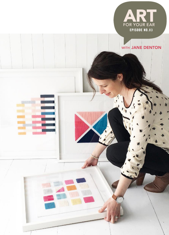
Simply complex, indeed! Beautiful colors, clean designs, and perfect stitching. Today I’m talking to New Zealand artist Jane Denton. As always, Jane and I have “known” each other for years, but today is the first time we’re talking. We recorded this just before Christmas so it was cold and snowing in my Canadian backyard and Jane was boiling hot on holiday at a lake in New Zealand! Well, even though we were on opposites sides of the world, I was still able to ask her all of the questions I’ve had for years. Ready? You can listen right up there under Jane and her gorgeous work, or you can subscribe on iTunes.
As usual, let’s start with a few of my favorites:
Sigh. The designer in me, who’s also obsessed with embroidery thread, is smitten. I mean, those colors, come on!
So, it turns out that Jane and I have a friend in common… the always fabulous LA based designer and stylist, Emily Henderson. She loves Jane’s work as much as I do, and in case you need proof, here are some images from Emily’s site. Oh, and first image below is the cover of Emily’s book, STYLED. Look to the far top right… oh hello, Jane Denton circles:
Gah! That light pink X and O in Emily’s nursery might be one of my favorites of Jane’s. Lovely, lovely detail and that delicate pink thread is killing me. So continuing with this artsy connection, Emily and Jane just did a “maker collaboration” together. Here’s the simple, yet complex, design that resulted:
Beautiful! I love how much texture Jane’s pieces bring to a gallery wall. {All of the photos are from Emily’s site, on the post she wrote about this project.}
This is a perfect segue into these next few images. Circles. Tricky on a square grid, yes? Um, yes:
… yet somehow Jane makes them look simple. Ahhhh, gorgeous. I had wrongly assumed that Jane went to design school – wouldn’t you think so with these beautifully composed pieces? Yeah, me too. Nope, business school. Hm. Perhaps that’s why she’s so good at the whole marketing thang.
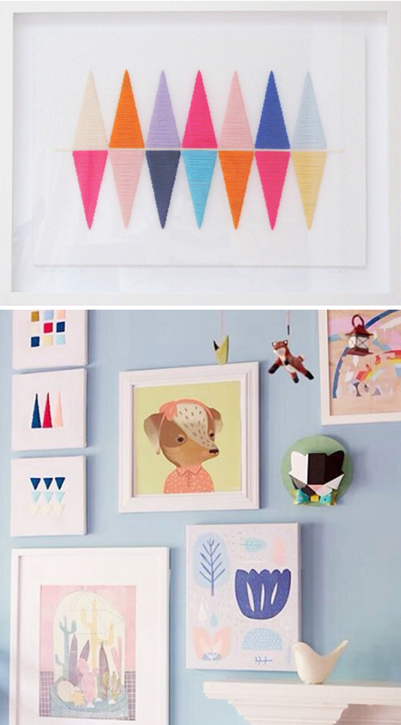
Up next, the two pieces I was a little bit involved with. The top piece was the pointy triangle piece that I brought to New York for a maker event, and the bottom piece {triptych on the far left} was her contribution to my Land of Nod collection:
Dreamy. All of it. And that’s that! Thanks so much to Jane for taking time out of her family holiday to do this with me; thank you to Saatchi Art for supporting yet another episode; and of course, thank you so much for listening! There will be more art for your ear next weekend.
Other Links:
- Jennifer Pudney’s kits
- Emily Henderson Collaboration
- Framebridge
- Jane’s online shop
- My new art site
- Susanna Bauer, Episode No.40
- Flight of the Conchords
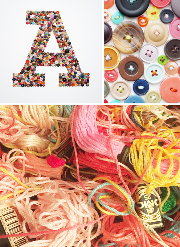
ps. This is my 4’x4′ “Type A” button piece I mentioned, along with photographic proof of how “organized” my thread jar is:
Yeesh.




Lovely stuff. I love where the colours overlap creating another colour.
Danielle… You should feel SO good about showing your work (and sending them off to kindergarten!!)
haha! thanks julie… i think i’m almost there : )
Love the way these simple/complex designed pieces are shown styled in a home settings. They really do instantly bring such a cool modern feel to a room. I also love this “A” and that is definitely how my thread box looks!
Hi Danielle, another great podcast! Thank you – and I LOVE your button A, love thinking of you having the satisfaction of 20 sewn on buttons when in that new mom fog!
haha! yep, i barely even remember doing it.